Graphic Designer
Frida Flores Duarte
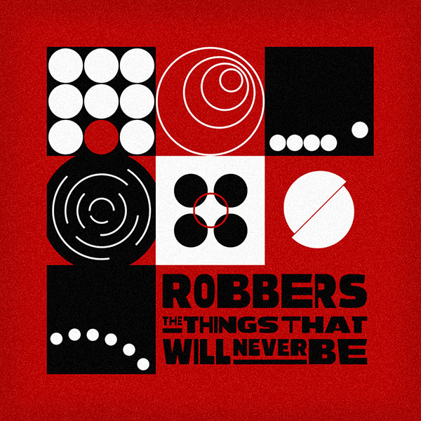
Knowing that they were looking for a minimal style, the simplest forms were used to create an abstract and central idea for their jams. A brainstorming was done when listening to them for the first time, where among the words that stood out the most were:
Loop, twists, circle, movement, pendulum.
It was then decided that the circle with different properties should be used as the basic figure to symbolize the improv.
This also starts from the sense of reflecting what their music is and how it remains in a flow, as you were telling me. In itself, it is a design that encompasses a whole playing in harmony but also shows elements with very own characteristics such as: repetition, rhythm and progression.
As for the color palette, we went for a classic: black and white; and then implement saturated red which is very attractive and represents dynamism, as well as the lack of silence.To complement, a totally altered typeface was used for a more edgy and energetic look. It was decided to add along with the name of the band, which generally represents the cover. And so the final art was reached